 In this page we compare atmospheric pressure at the sea's surface (known as MSL pressure) from
NOAA's GFS model with
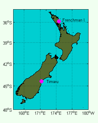
the pressure measured by barometers at Frenchman Island, near Marsden Point on the northeast coast of the North Island
and at Timaru on the eastern coast of the South Island, as shown to the right.
In this page we compare atmospheric pressure at the sea's surface (known as MSL pressure) from
NOAA's GFS model with
the pressure measured by barometers at Frenchman Island, near Marsden Point on the northeast coast of the North Island
and at Timaru on the eastern coast of the South Island, as shown to the right.
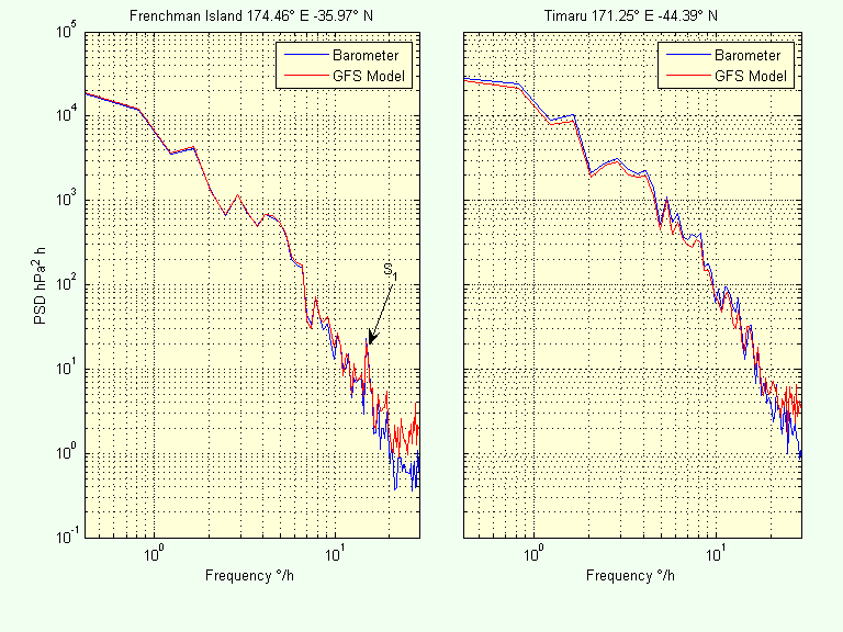
The comparison is made in three different ways:
(i) statistical moments;
(ii) a typical times series; and
(iii) spectra.
The analyses were carried out on 1 year of data from 15 July 2004 to 15 July 2005.
The table below displays the first through fourth statistical moments for each time series. Let us consider each of these moments in turn
We would expect the mean pressure to be higher in the north (nearer the equator), than in the south, but the barometers indicate the opposite. This indicates that the barometers have not been calibrated for mean sea level pressure and have an offset. This may be because they are mounted above sea level. Notice that the GFS model correctly shows higher mean pressure in the north.
The barometers and the GFS model are in close agreement for the 2nd moment, with the southern site having significantly higher standard deviation.
| Statistical Moment | Frenchman Island | Timaru | ||
| Barometer | GFS Model | Barometer | GFS Model | |
| Mean | 1013.9 | 1015.5 | 1014.2 | 1012.2 |
| Std Dev | 7.73 | 7.83 | 11.28 | 10.67 |
| Skewness | -0.213 | -0.195 | -0.267 | -0.302 |
| Kurtosis | -0.203 | -0.207 | -0.557 | -0.493 |
Negative skewness tells us that the troughs are generally deeper than the peaks, which is intuitively correct because high-pressure systems generally last longer and are less extreme than low-pressure systems. The more negative skewness for the southern site indicates deeper low-pressure systems than occur in the north. Skewness is quite sensitive to small differences in the extremes of the signal, so the comparison between barometer and the GFS model is essentially as close as could be expected.
Kurtosis indicates the flatness of the peaks and troughs relative to what we would get if pressure were distributed normally (when kurtosis would be zero). Negative kurtosis indicates the peaks and troughs are flatter than normal. Kurtosis is also a good indicator of spikes in the data. A single large spike will result in large, positive kurtosis.
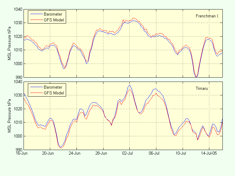
A typical month of record is shown in the figure below. The slight offset in the mean of the signals is shown quite clearly by this plot. Notice that almost all the fluctuations recorded by the barometers are also present in the GFS model data.